Boston Brownstone with an Elevated Update
Filled with Victorian-era brownstones, the South End is one of Boston’s oldest neighborhoods. It offers vibrant city life with suburban benefits, including dozens of parks and community gardens. It attracts residents looking for the best of both words—a modern setting with historic roots.

The room is narrow, but the centered daybed adds versatility to the design and helps create distinct conversation areas.
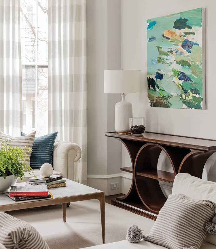
A light color palette requires counterpoints to make this design come alive. Dark pieces (like the console and leather chairs) and colorful touches (like the painting from a local artist) help ground the airy room.
Although shelving filled with backward books is nontraditional, the designer opted for this styling to keep the look light and airy, while still keeping the homeowner’s books accessible.
The young family that owned this brownstone wanted to give it an aesthetic makeover. The interior had already been updated, but the design needed a more styled look. That’s where Jill Goldberg, owner of Boston-based Hudson Interior Designs and a local retail shop, came in. “These clients were fans of my shop, where I showcase a bit of what I do,” says Goldberg. “They reached out to me because they wanted to pull together the look they had started to create in their home.”
Features original to the home included crown molding, ceiling medallions, and a fireplace with a marble surround. Hardwired light fixtures and a sofa had already been added to the space before Goldberg joined the project, but the homeowners needed other furniture and accessories to bring it all together. “They wanted to play up the modern side of the traditional style that they are attracted to,” explains Goldberg.
The couple needed the living space to hold up to the demands of their two young children and a dog while still being elegant and chic. “They wanted something livable and comfortable, but with a slightly elevated style,” says Goldberg.
The choice of furniture with curved edges was both aesthetic and practical. Aesthetically, the rounded pieces helped offset the hard angles found in Victorian homes. Practically, however, these choices were necessary. The room is narrow, so smooth-edge frames and soft fabrics keep kids safe and keep the room from feeling like an obstacle course for adults.
A daybed sits in the center of the room, helping to delineate conversation zones. On one side sits a sofa backed by sheer, striped panels. Two leather chairs sit on the opposite side. The couple wanted the room to feel fresh and open. “For me, that aesthetic creates a modern edge,” says Goldberg. “Yet we were still able to create depth and contrast with the darker pieces, like the console and chairs.”
Two champagne gold–leaf bookcases with glass shelving presented a blank canvas for Goldberg to get creative. “A big part of this design was keeping it light and airy,” she says. “It would be a shock to see all the colors used on these books covers. So we decided to flip them around so you only saw the shades of cream from their interiors.” The designer acknowledges that was an unusual approach, but also recognizes how that choice affected the room’s feel. “As much as you don’t want things to seem ‘designed,’ sometimes it’s needed. Those shades of paper add a cool neutrality and the client didn’t mind pulling books out to check the titles.”
For living spaces especially, it all comes down to how they make you feel. “When we grew up, our parents had those living rooms that were off limits, only used when their friends came over. Today, everybody wants to use every space in their homes,” she says. “It’s important to make spaces as friendly as possible. Rooms can feel designed and sophisticated, while still feeling livable.”
living easy
Designer Jill Goldberg offers these tips to create cozy living spaces.
Material matters. A cozy space is one where you feel at ease. You can’t feel comfortable if you’re petrified of ruining your sofa. Choose performance fabrics so you know they are stain resistant and easy to clean.
Let there be light. “Overhead lights can be too bold. I’m a big fan of lamps and low lighting,” says Goldberg. Warm, soft lights set the tone in a space and make it feel inviting.
Keep treasures up high. If you have young children and pets, keep valued items out of reach. Put paintings and photos on your walls and precious objects on high shelves. That way you don’t have to fear your decor will be damaged.
Make it yours. “A space should represent who you are, your style, your personality, your soul,” says Goldberg. She says a living space should show what you’re interested in and attracted to.
WRITTEN BY RONDA SWANEY / PHOTOGRAPHY BY MICHAEL J. LEE

