FROM NONDESCRIPT KITCHEN TO COLORFUL COOKSPACE
When Kelly Emerson (senior designer) and Nadia N. Subaran (principal) of Aidan Design were first contacted by their client about a kitchen renovation, they knew it would be a rewarding project. The circa-1943 Colonial Revival home located in the Forest Hills neighborhood of Washington, DC, had seen updates. But after the homeowners lived in the home for three years, they decided the kitchen needed their personal stamp.


“Our client has such great style and is a design enthusiast,” says Emerson. “She loves color, and she knew exactly what she wanted. We knew going into this that it would be a fun project.” The existing kitchen featured outdated, nondescript white Thermofoil cabinets and black granite countertops that made the kitchen feel dark and closed in. Column and pilaster architectural details detracted from the impressive, tall ceilings and arched windows. The footprint of the existing kitchen was workable; however, the flow of the room was not. An island with no overhang left the kitchen with no area to gather for a quick meal or homework prep with the couple’s kids. “The bones were there to work with,” says Emerson. Adds the homeowner: “I didn’t want a kitchen that felt like an extension of a living room,” she says. “The kitchen is a fun, comforting place so I wanted the design to reflect that.”
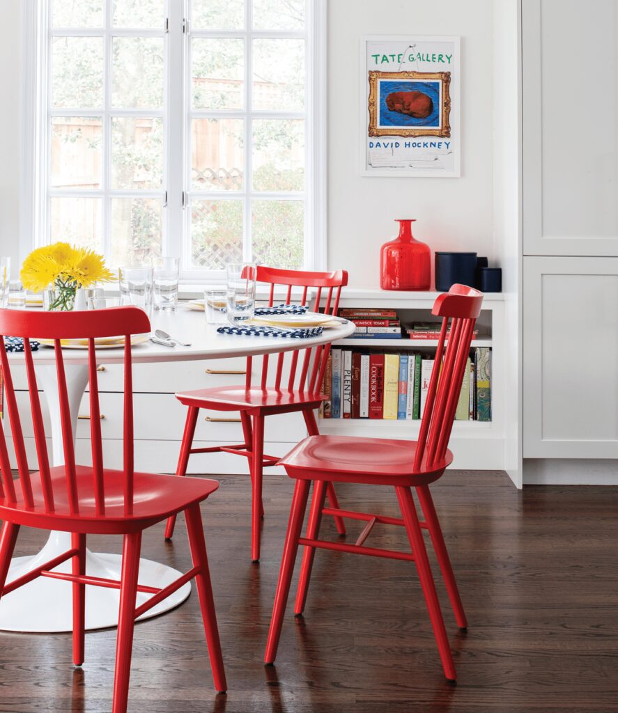
To provide storage without it feeling cabinetry-heavy, long paneled sections were added such as a pantry cabinet, which the designers placed next to the fridge and an under-the-window drawer storage. A bank of lower cabinets by the home’s entryway mimics the look of a console table.
Beyond the layout and architectural details, the traditional black-and-white look was a touch too neutral for the color-loving homeowner. “The interiors had been updated to a certain extent but it wasn’t my aesthetic,” says the homeowner. “I have a much more eclectic look. I don’t follow one design rule book because I think it’s kind of boring.”
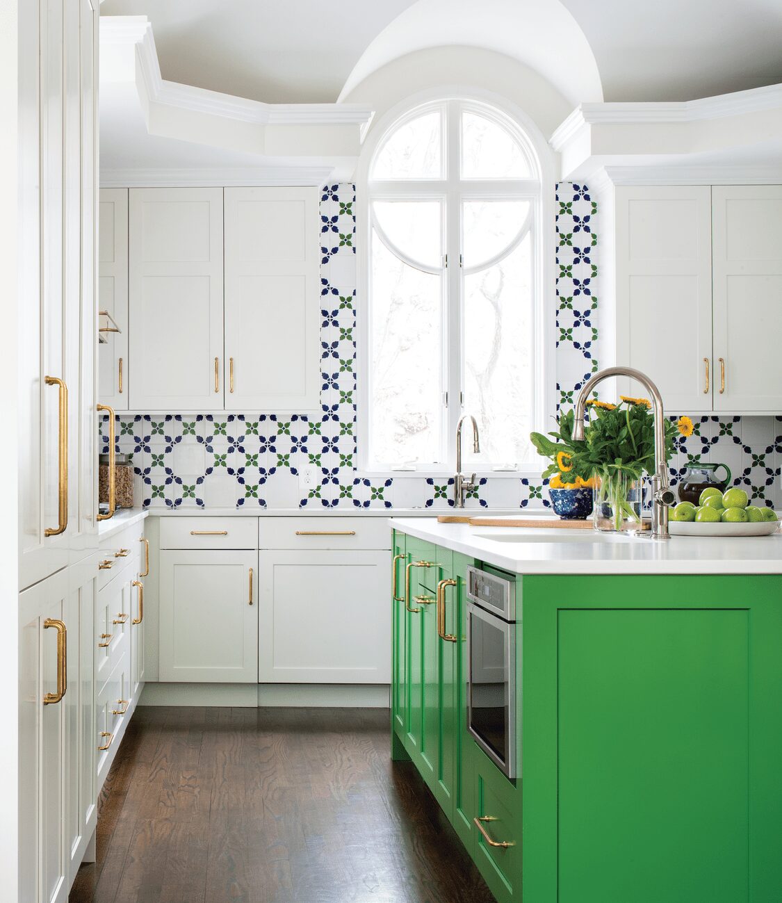
To begin the makeover process, Emerson and Subaran added a larger island that could accommodate counter stools for gathering. To open the space, the designers tweaked the cabinetry layout by removing some of the upper cabinetry, allowing the room to breathe and the eye-catching copper range hood to shine. To accommodate the family’s love of cooking, the designers added a second oven and sink plus modular refrigeration versus one large refrigerator, which can oftentimes look clunky and out of place.
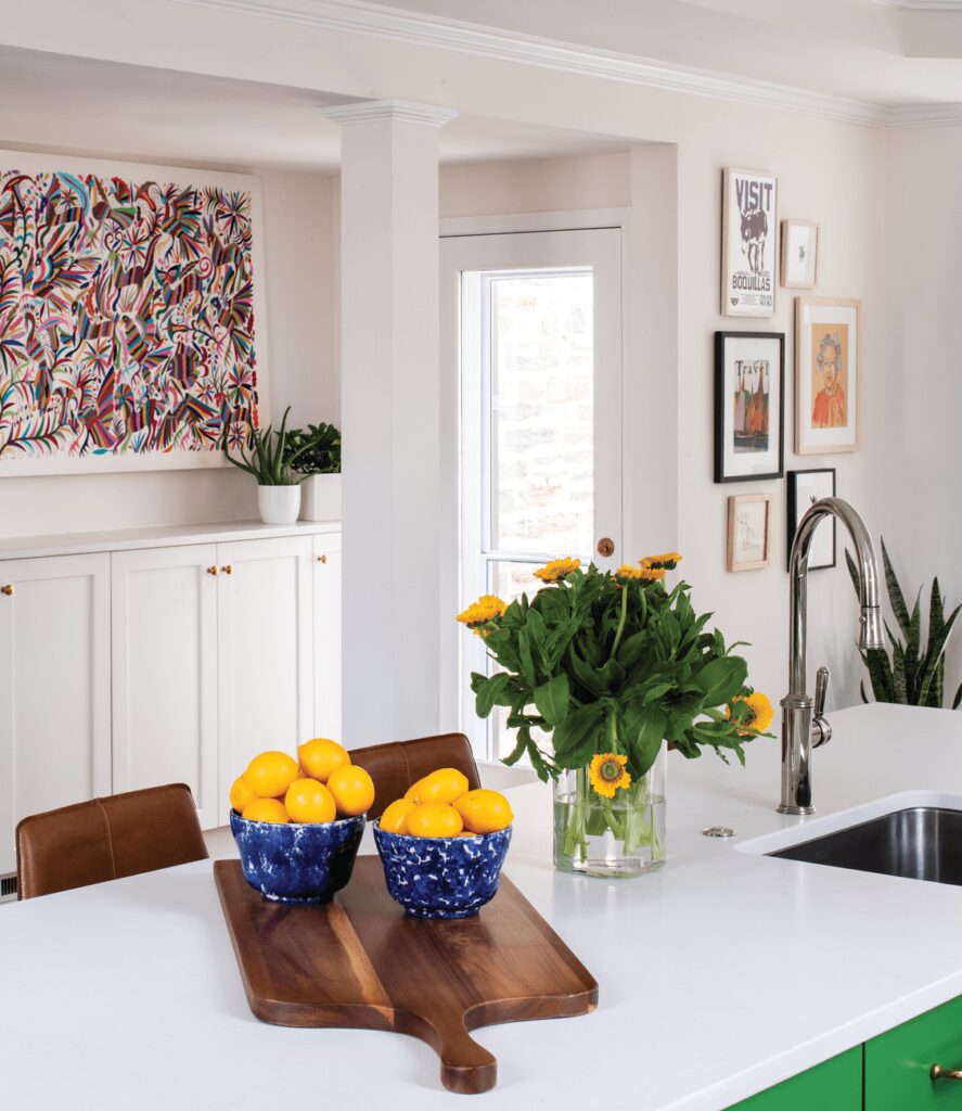
Color was incredibly important, as well. “I wanted a lot of color,” laughs the homeowner, who has a penchant for Swedish midcentury design. A ninety-four-by-forty-inch embroidered Mexican Otomi wall hanging that the homeowner had commissioned served as inspiration for the kitchen’s color palette—including the Kelly-green cabinetry on the island. “The homeowner had a lot of Swedish-inspired elements that provided a simplicity to the overall design,” explains Emerson. After spotting a backsplash tile in a magazine, the homeowner eventually found a similar custom tile for the backsplash to complete the unique look she wanted. White-oak floors with a dark-walnut stain coupled with leather counter stools by west elm add warmth to the sleeker, cleaner look of the kitchen. “We love to complement vibrant colors with warm tones,” says Emerson.
The fresh remodel gave the kitchen new life and transformed it from an outdated and dark space to a bright and happy place for the family of four to gather, cook, and entertain together. “This is what I envisioned when we first began this project,” says the homeowner.
do or don’t?
When remodeling a kitchen, there are several things to consider. Designer Kelly Emerson offers her top kitchen dos and don’ts.
Do invest in a designer who can help create a functional kitchen layout. If appliance locations are problematic when more than one person is working in the kitchen, consider expanding the renovation for a better flow.
Do consider the larger elements first. Because the lifespan of a fully renovated kitchen is about twenty to twenty-five years, homeowners should invest in timeless finishes for the larger items, such as flooring and cabinetry. Countertops, tile, hardware, and decorative lighting can easily be updated ten to fifteen years down the road, if desired.
Don’t make appliance selection a last priority. Research and consult with your designer and appliance representative. There are many energy-efficient and healthy cooking options, so find out what’s available before making a final decision.
Don’t select knobs for all the cabinetry. Consider instead a mix of knobs and pulls. Cabinet pulls reduce the physical touching of the cabinetry. Install pulls for regularly accessed locations and knobs for cabinetry that is less frequently used.
Don’t cut costs with your tile selections. A tile backsplash is a simple way to elevate a kitchen’s aesthetic.

