Reimagined Landscaping Completes a Modern Makeover
WRITTEN BY VICTORIA HITTNER / PHOTOGRAPHY BY JAMES JONES
For Bianca Bodley, owner and principal designer of Biophilia Design Collective, landscaping is all about harmony. Her Victoria, British Columbia–based firm specializes in both landscape design and project management for residential and commercial properties.

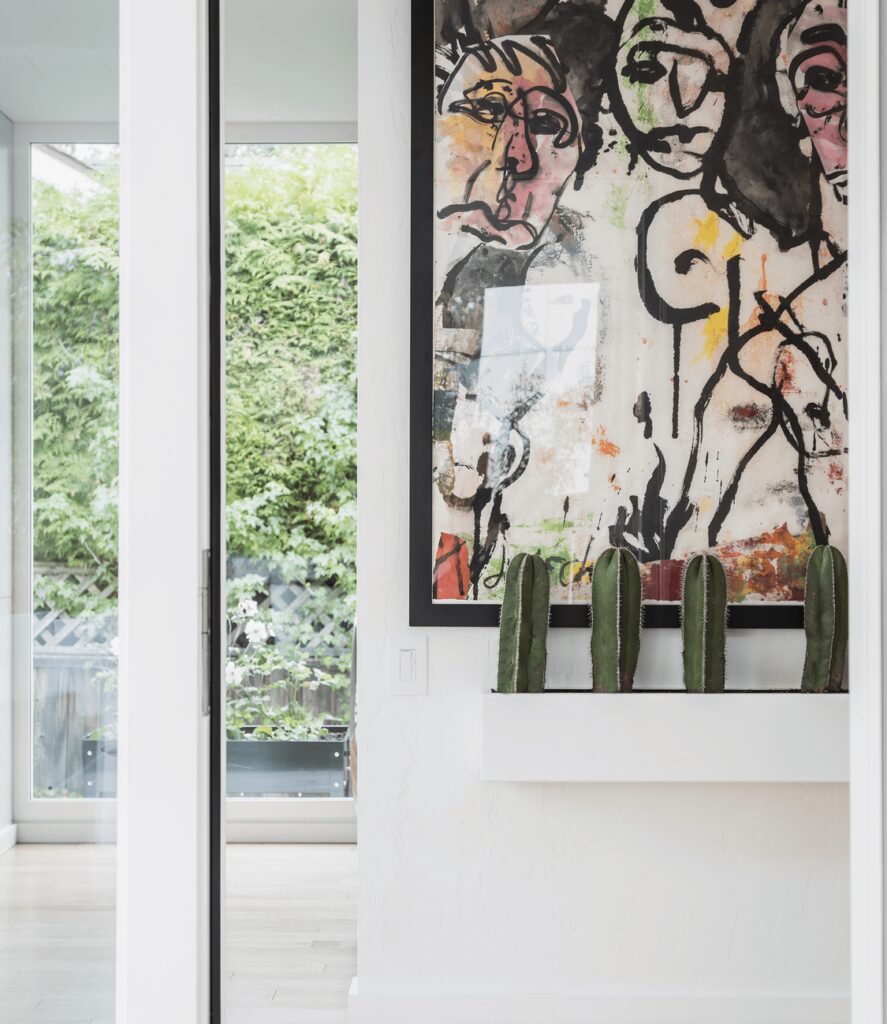
The home’s outdoor spaces are as art-inspired as its interior. Bodley describes the boxwood hedge in the back garden as an “elevated frame,” while ornamental grasses and bamboo draw the eye with movement and texture.
“When I look at a landscape—whether it is a small urban garden like this one or rural acreage—I see it as pared back to the original form as possible and build forward from that in my mind,” she says. “We treat the land, the existing flora, and the overall site context as equal stakeholders in the design process. If the design we achieve honors both the land and the client, then we have succeeded.”
In the case of this home, nestled in the tree-shaded neighborhood of Fairfield, creating a cohesive transition from the indoor to outdoor spaces was paramount. Bodley and her team worked previously with both the homeowners and the on-board architect, D’Arcy Jones. Collaborating closely with Jones, Bodley and her team crafted a retreat that honored existing tenets of the landscape—like the stately Garry oak and cedar trees—while matching the fresh, modern aesthetic of the renovation.
Whenever possible, Bodley incorporated existing plants and native species to keep the garden rooted in place. “Using indigenous plants, for me, is all about restoration and giving back to the land,” she explains. “They also provide food for people and birds, and they just feel grounded. I like to use them en masse just as they are found in nature, in beautiful swaths.”
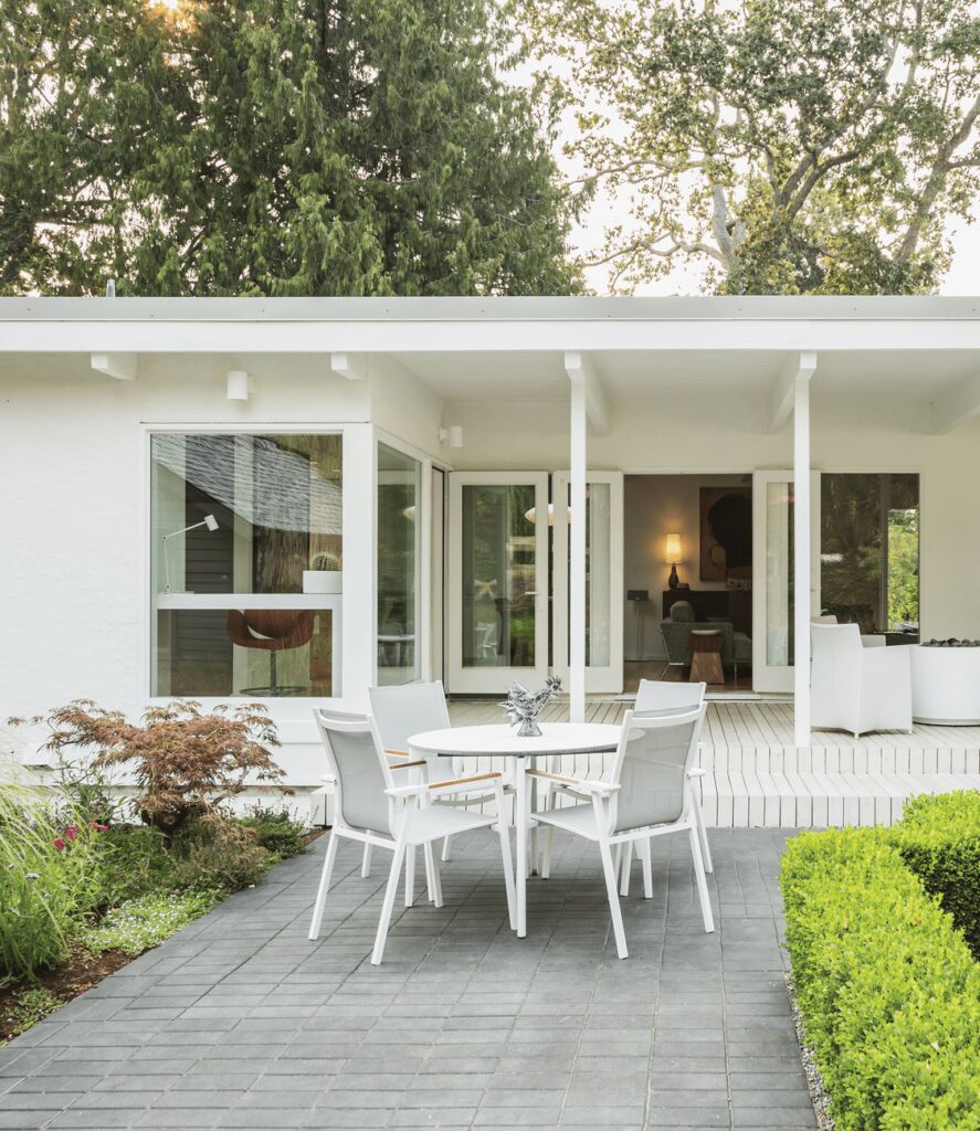
In the front garden, native ferns and rhododendrons complement a hedge of English laurels offering structure and privacy. An existing boxwood hedge in the back garden serves as a natural frame for focal pieces like the clients’ art installation and blooming roses. The woodier elements help demarcate spaces, creating a flow and organization akin to interior rooms.
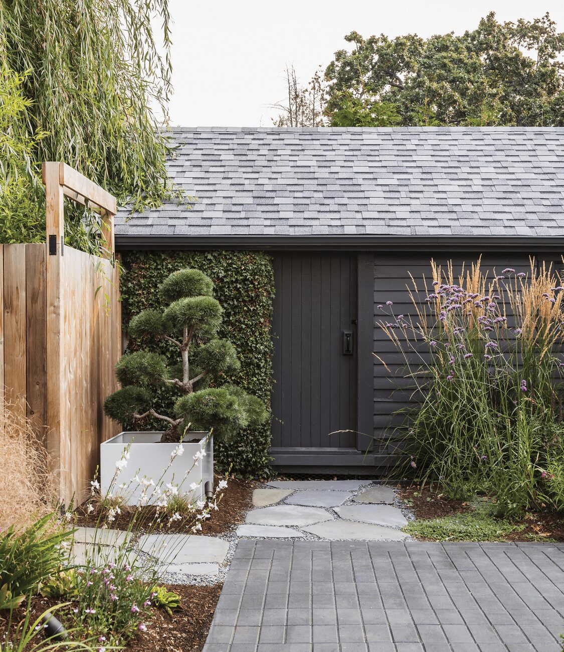
“The evergreen backdrop was the anchor in both the front and the back gardens,” explains Bodley. In many pockets of the design, texture plays a greater role than color. For depth and visual interest when revitalizing a landscape, the designer recommends investing in mature trees and shrubs and filling in with smaller, faster-growing perennials and grasses.
“Texture is important as it allows you to create mood,” says the designer. “The structure of evergreens allows you to define a space and draw the eye, [giving] you the feeling of privacy and enclosure. Soft and movable plants such as grasses and bamboo offer a sense of peace and interactivity, as they respond to their changing environment.”

Come autumn, the grasses also bring a touch of honeyed color to the garden. Flowering perennials add further seasonal splashes in pinks, purples, and whites. Keeping the color scheme of the vegetation simple allowed Bodley and her team to play with starker contrasts in the hardscaping.
“The color palette of the house inside and out, as designed by [architect] D’Arcy Jones, is a bold and clean, white aesthetic. This extended to the decking that was stained white and leads the eye seamlessly between the inside living room to the outside living space. We wanted to continue this bold and clean approach to our material and color selections for the exterior . . . but in a contrasting tonality of dark against the white.”
For the main patio, Bodley chose charcoal pavers, while smooth concrete and pea gravel form the main pathways connecting the front and back gardens. Junctures and stairs are punctuated with flagstone and black basalt. At night, uplighting illuminates the front garden path, as well as natural focal points like the large oak tree in front and bamboo in the back garden.
One of Bodley’s favorite aspects of the design is the sleek, white planters. The powder-coated metal pieces can be found on the deck, throughout the back garden, and inside the home. “For me,” notes Bodley, “it was like taking the white, art-gallery feel of their interior outside to allow the plants in the garden to be displayed in their own room . . . I feel like [the planters] are a strong connecting art element between the house and the landscape.”
The tidy pathways and multiple seating areas invite continuous exploration and enjoyment, balancing just the right amount of modern intrigue with the more traditional aspects of a garden retreat.
“The clients love art and color, but they also wanted a serene space that complemented their beautiful home,” says Bodley. “This garden, for me, is a reflection of the spirit of my clients; it’s really important to me that the gardens I design have this connection.”
“THE CLIENTS LOVE ART AND COLOR, BUT THEY ALSO WANTED A SERENE SPACE THAT COMPLEMENTED THEIR BEAUTIFUL HOME.”

