LEGENDARY MIDCENTURY HOME LIVES ITS BEST LIFE
WRITTEN BY KATHRYN O’SHEA-EVANS / PHOTOGRAPHY BY SABRINA HUANG PHOTOGRAPHY
If George and Jane Jetson were seeking a new home, they may have gravitated toward this property, famously made of glass and corrugated steel, in the San Mateo Highlands of California. It was designed in 1956 to be an “Experiential House of the Future” by famed architect A. Quincy Jones for developer Joseph Eichler—also known as the forefather of the California modern look. Making the home all the more important to that particular cultural sphere? It’s owned by Marty Arbunich, the director of the Eichler Network and publisher of quarterly magazine CA-Modern.

Flickering in the main living space: a fireplace designer Lucile Glessner had made by Malm Fireplaces to replace a lackluster one from a previous owner. The painted copper mobile is from MODmobiles.
Original planters embedded in the ground allow flora to flourish in the abundance of natural light.
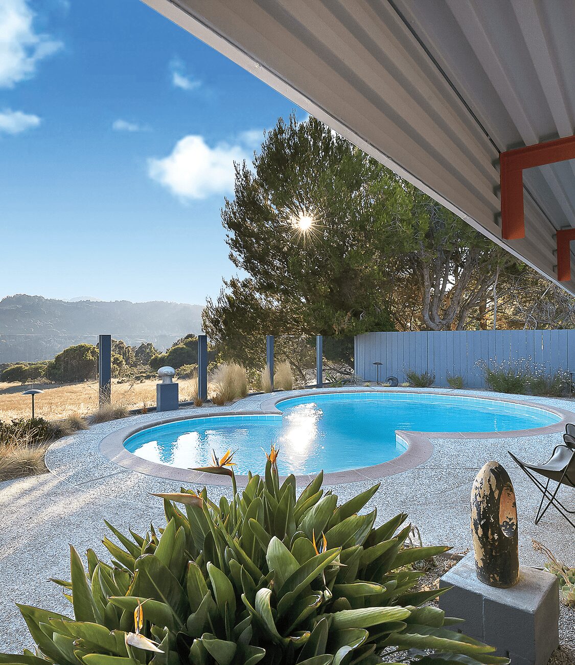
The only thing better than a pool is a pool with a view (and butterfly chairs for sunset lounging).
It’s no wonder Saratoga, California-based designer Lucile Glessner approached the project with kid gloves, spending upwards of two years perfecting every inch, while preserving all the storied bones that makes the place the eye candy it is. “I’ve worked on a few Eichlers, and this one is really unique because it was really an experimental home—it was called The House of the Future, and had a lot of different aspects that were new for the time,” says Glessner. Among them: an interphone that allowed you to chat with friends and family in different rooms of the house, and actual lights over the skylights to illuminate spaces long after the sun went down.
Blessedly, Arbunich knew they had to add a little more “modern” to the midcentury style to let the house thrive today. “He’s a mine of information and was very involved, but at the same time he understood we were not trying to make a time capsule,” says Glessner. So while the original ovens in the open kitchen still worked, they swapped in an eco-friendly induction cooktop, and updated the fridge. Aside from the walls, which the designer cozied up with a deep, warm gray, “We did restore the home to what it was originally with regards to colors,” she says. Take that Crayola-bright, orange-red hue adorning the columns and beams overhead. “We looked into the actual paint company from Canada and called them to see if they had any of those colors left, and they didn’t. So we scraped the original layers of paint and got to what the original orange-red was, and I matched it.” Glessner felt she had to. Over the years, the home had been muddied with a subtle palette “that just didn’t reflect the house, so I really got back to the vibrancy” of what the first design team intended.
For the interiors, Glessler selected a blend of mass-market finds (such as West Elm) and 1st Dibs antiques that hew closely to the Eichler era. “I wanted a combination, so we have some things that are today and some vintage.” But the pièce de résistance is arguably the fireplace, which they had custom made to replicate what was there at the start, since a previous owner had traded in a less-than-Eichler-worthy stove. Saturated upholstery colors, sculptural art, and soft touches like faux-fur throw rugs turn the expansive spaces into something that’s “a lot warmer and cozier,” she says. “This home is very organic . . . all these shapes and colors make it a really dynamic and fun home. It cannot be cold when you have all of that going on.”
Speaking of organic: Glessner found that maximizing nature was essential to creating a welcoming feeling in the clean-lined abode. “Because of the views and all of the biophilic design that happens in that house, you have plants everywhere that are actually planted in the ground; at the floor level, you have these beautiful plantings that are inside the house; and lots of skylights, which was new at the time, so you have a lot of natural light.”
Also aiding in the design: the fact that the property is nothing less than iconic. A plethora of ephemera existed for Glessner to pour over during her research for the project. “The house had been really changed over the years, so we were working from photographs. Thank God it’s a very documented home—you can even get on YouTube and find Eichler videos where it was shown as what the modern home could be. It was a model home and had a lot of press.” And because much of the structure was made out of steel, from the ceiling to the columns to the doors, “it did really well over the years.” And now, it will do even better.
nods to mod
Here, Lucile Glessner’s guide to perfection in midcentury-modern interiors.
Shop Smarter. “You could just go to Design Within Reach and pick [furniture and accessories] from there, but if you want to be original, you might want to mix in different things. For instance, there’s this Danish designer, Finn Juhl, who is not as well known, but has sophisticated furniture that’s less seen than Le Corbusier or Eames.”
Lucky Find. “Cherner chairs are just gorgeous and work well with almost any table. The stools are beautiful from the back—you can’t beat them!”
Remember Your Lines. “Now, you have a lot of furniture that doesn’t have legs, but then most of the furniture was off the floor. Midcentury-modern pieces were more airy, lighter, and not as bulky.”
The circular stone bubbles underfoot are original, but the gleaming black vinyl floors are new (a replacement for cork flooring that was too timeworn).
This peppy desk might just be the ultimate work-from-home space, thanks to energy-boosting floor-to-ceiling windows.
“this home is very organic . . . all these shapes and colors make it a really dynamic and fun home.”

Deborah Farmer


