EAST COAST RENOVATION WITH A MIDDLE EASTERN VIBE
WRITTEN BY RONDA SWANEY / PHOTOGRAPHY BY MICHAEL J. LEE

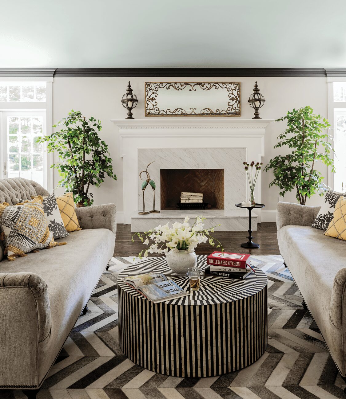
As a farmhouse, the idea of “living off the land” inspired much of the decor, although in an elevated interpretation. In this room, that’s reflected in the bone-inlay table and animal-hide rug.
The formal living room was first to be designed and it guided the home’s overall aesthetic.
The owners wanted the primary bedroom to feel opulent, which is accomplished with metallic grasscloth, rich velvet, and ornate mirrors.
“When we walked in for the first time, there was nothing to see. It was literally just the home’s original shell and components with the original chestnut wood beams, columns, stone walls, things that had been buried behind drywall for years,” says Brad Dufton, about this circa-1700s Medfield, Massachusetts home. He and Kendra Dufton own and operate Color Theory Boston, an interior design and paint color consultation firm.
One of the home’s owners, a professional chef and restaurateur, decided the kitchen in the home was too small. To accommodate the family of six, plus extended family in the area, the kitchen needed to be expanded and primed for entertaining. The owners worked with their architect to add a substantial addition, leading to an 8,000-square-foot house. The chef-homeowner is also an immigrant from Lebanon, proud of the success he’s achieved in America. He wanted the home to reflect both—a nod to his home country’s roots and an appreciation for his adopted country’s history.
“It was interesting and fun to take on this Americana-meets-Lebanon aesthetic,” says Kendra.
“That provided clear-cut direction, which made this project super easy for us. We knew exactly what to do,” notes Brad.
Such direction fit right in with the design duo’s aesthetic. “Brad and I don’t have one style we gravitate toward. Our clients understand that there will be some elements that take them by surprise,” says Kendra. Living in New England enhances the couple’s appreciation of American periods of architecture from Colonial to Victorian to Art Deco. The cosmopolitan nature of the modern city also shows up in their designs, as the influence of world cultures often mixes with an Americana aesthetic.
The homeowners met with another designer who wanted to take a traditional approach to the design, but that failed to inspire them. “What sealed the deal for us was that the homeowners felt a bit nervous, not knowing exactly what they would get or what we’d put together,” explains Kendra.
Brad explains how they overcome those nerves. “We get our clients’ toes wet by starting first with the color palette for the home. That approach allows them to see we’re all on the same page. Once we know paint colors and wallpapers, it becomes very efficient design-wise to select textiles, rugs, artwork, metal finishes,” he says.
For this home, the resulting design married a jewel-toned opulence with some of the home’s more rustic original features. Nowhere is that more apparent than the formal living room, which you see as you walk in the front door. “That was the first room we designed for the home. It helped put the homeowners at ease that we understood what they wanted,” explains Brad. “That room is the spokesperson for the entire home. It lets you know what to expect as you continue your journey through the house. It lets you know that nothing should be expected, but at the same time everything is completely calculated.”
The green wall color harkens back to the home’s original era. Green, as well as the blue used in that room, were traditional New England colors. Books, arranged artistically on the built-in shelves, were found in an old barn on the property and may have been in the possession of many of the home’s former owners. Even with all that original history in place, the room still contains touches of Lebanon. Those touches include the olive-leaf design of the overhead light and sparkle from the antique gold convex mirror on the wall.
Kendra, however, feels most drawn to the kitchen. Much of that space is part of the new addition, but it also provides a literal link between the past and the present. “I love the combination of old and new. The fact that there are so many elements original to the home in that room really excites me along with just how functional it is,” she says. The room also highlights the level of trust between the designers and homeowners. Part of that trust included using Bermuda Turquoise as the cabinet color. The homeowners originally wanted a more traditional blue, but the Duftons convinced them to try a modern spin. They also agreed to try the inlay tile flooring beneath the expansive dining table. “That was a tile pattern that we had loved and admired for some time. An inlay tile floor was something we hadn’t done before, so we had to ask them to take a risk,” Kendra explains.
Everywhere you turn, those risks, those creative leaps of faith paid off in this home that speaks perfectly to the family’s and the home’s histories. From richly colored wallpapers to a modern-day hookah lounge to far-flung antique finds, each element was meticulously chosen. “We knew what this project could be if we put in the time and effort and gained the trust of this family,” says Kendra. “We knew it could be outstanding and something they never would have conceived of themselves.”
The dining room color palette was inspired by a painting—obtained on the homeowners’ honeymoon to Lebanon—and now hangs on the wall.
“Our clients understand that there will be some elements that take them by surprise.”
The kitchen addition marries old with new and reveals the passions and pastimes of the owners. Original fireplaces as well as chestnut posts and beams mix with new cabinetry, tile inlay floor, and modern charcuterie and coffee stations.

Deborah Farmer


