A VICTORIAN MOUNTAIN HOME WITH CHARM
WRITTEN BY LAUREN DUNEC HOANG / PHOTOGRAPHY BY EMILY MINTON REDFIELD
Tucked away in the small mountain town of Crested Butte, Colorado, this colorful, quirky cottage is far from what one might expect a typical alpine home to look like. Built in the 1890s, the Victorian painted lady has peach-colored clapboard with a sky-blue trim and decorative curlicues adorning the gable. It was the cottage’s historic details that first captured the heart of the homeowner—a real estate investor, avid skier, and outdoorswoman—as well as the laid-back, bohemian vibe of the town.

Splashy suzani and ikat fabrics combine with turquoise and buttery ocher cabinetry for a kitchen color scheme that’s a feast for the senses.


The dining area was reconfigured to include a cozy, cottage-style seating nook.
While the cottage looked charming from the outside, inside it was in need of repair. So the homeowner enlisted I.D Studio, a local design firm, to draw up plans for the restoration. Keeping the exterior intact, the interior of the 2,400-square-foot home was completely gutted. First, the building was raised to accommodate a new foundation and basement. Next, the framework of the interiors began to take shape including details such as beadboard siding and antique pine floors.
With construction completed, the homeowner called on Denver-based interior designer Andrea Schumacher to help select furnishings, complete the kitchen, and design a larger primary bath. Overall, the homeowner wanted the interiors to be as bold and colorful as the home’s exterior and include pieces that would reflect her global travels. No stranger to using adventurous combinations of color and pattern, Schumacher was the perfect designer for the job.
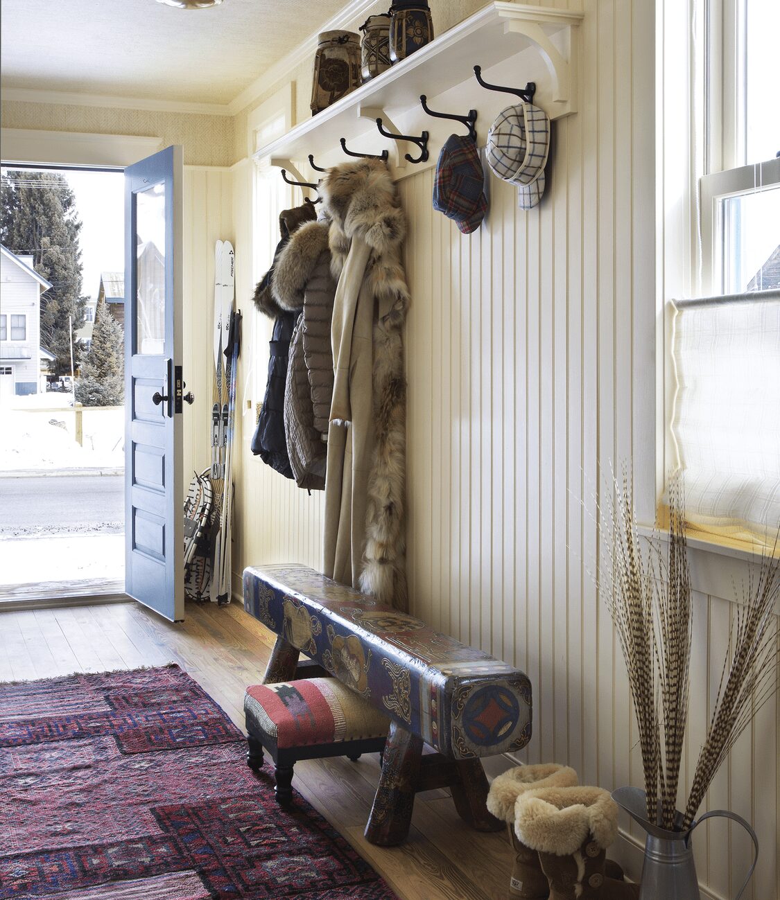
When entering the cottage, one is first greeted by a peace sign hung next to the front door—a hat tip to the hippies who settled in Crested Butte in the 1960s and ’70s. In the narrow entry hall, hooks provide convenient spots for hanging coats. The beadboard walls were kept intentionally neutral, but Schumacher brought in color in the form of a hand-painted Tibetan bench and coordinating rich tones of an Oriental rug made from antique textiles. Both of these features, as well as a collection of Asian ceramic jugs, help set the global, East-meets-West style the homeowner was after.
Schumacher says she used the striking Tiffany-blue of the already-painted kitchen cabinets as inspiration for the home’s interior color palette. “We played off the blue kitchen and then found the fabric used for the breakfast nook and matching Roman blinds to pull the rest of the house’s colors from,” she says. This palette-defining fabric (Cowtan & Tout’s Hurlingham print in Aqua) includes colors such as robin’s-egg blue, coral, carmine red, pale green, and earthy ocher and brown tones.
The designer stuck to these hues to add consistency across contrasting prints and patterns used throughout the home. For example, in the kitchen she upholstered Ballard counter stools in a suzani print fabric for the outsides and a striped fabric for the insides and seats. Above the new kitchen island, an oversize ikat print jazzes up the hood. The mixing and matching works together with ease because the prints all draw from the same color palette.
The print party continues upstairs. In the primary bedroom, Schumacher fashioned a tasseled canopy over the bed with a length of Indian block print floral fabric. “The lines of the ceiling limited the headboard height, so we added this layer to give it the semblance of an intimate canopy,” she says. A teal bedside table and a muted rug with hints of coral complement the block print fabric. The overall result is a space that feels feminine, playful, and unexpected.
In the primary bath, slanted ceilings dictated the placement of the glass-encased shower in the middle of the room. Schumacher centered a clawfoot tub against the wall of windows with semitranslucent shades to add privacy but still allow for natural light. The blue of the tub draws from the same color palette used in the kitchen and the floral print Roman blind relates to the bed canopy.
Whether the seasonal landscape is blanketed in sparkling snow or lush greenery, this painted lady offers a cozy, eclectic, and wonderfully colorful place to retreat.
pattern play
Bright colors and bold patterns have an extraordinary mood-boosting power in interior spaces. But with limitless options of prints and patterns, it’s hard to know where to begin. Andrea Schumacher’s advice? “Find one item or pattern to use as a jumping-off point.” For example, the designer says she might identify a favorite vase that belonged to the client’s grandmother or a vintage chair in a striking color among someone’s existing furniture collection. From there, she pulls patterns that pick up the hues in the inspiration piece for consistency. Schumacher will also play around with fabric swatches that might not ordinarily match. But once the fabrics take the form of cushions and curtains, the unexpected choices end up adding a certain X factor to a room. “This creates visually exciting interiors and brings energy to a space,” says the designer.
The home’s entryway acts as a catchall for winter coats, hats, ski gear, and snowshoes. But the space is not purely practical—it’s stylish and welcoming, too.


The primary bedroom is tucked into the gable, accented by a floral canopy, romantic linens, and fuzzy footstools.

Deborah Farmer


