A HISTORICAL HOME GETS AN INDOOR-OUTDOOR MAKEOVER FOR THE AGES
WRITTEN BY KATHRYN O’SHEA-EVANS
PHOTOGRAPHY BY KAT ALVES AND CREATE + GATHER
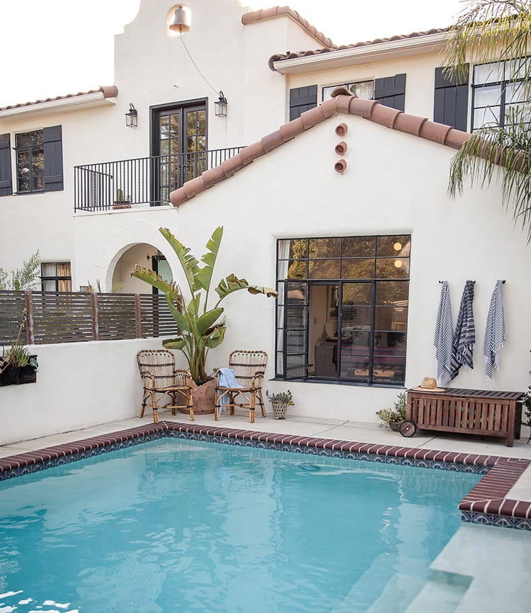
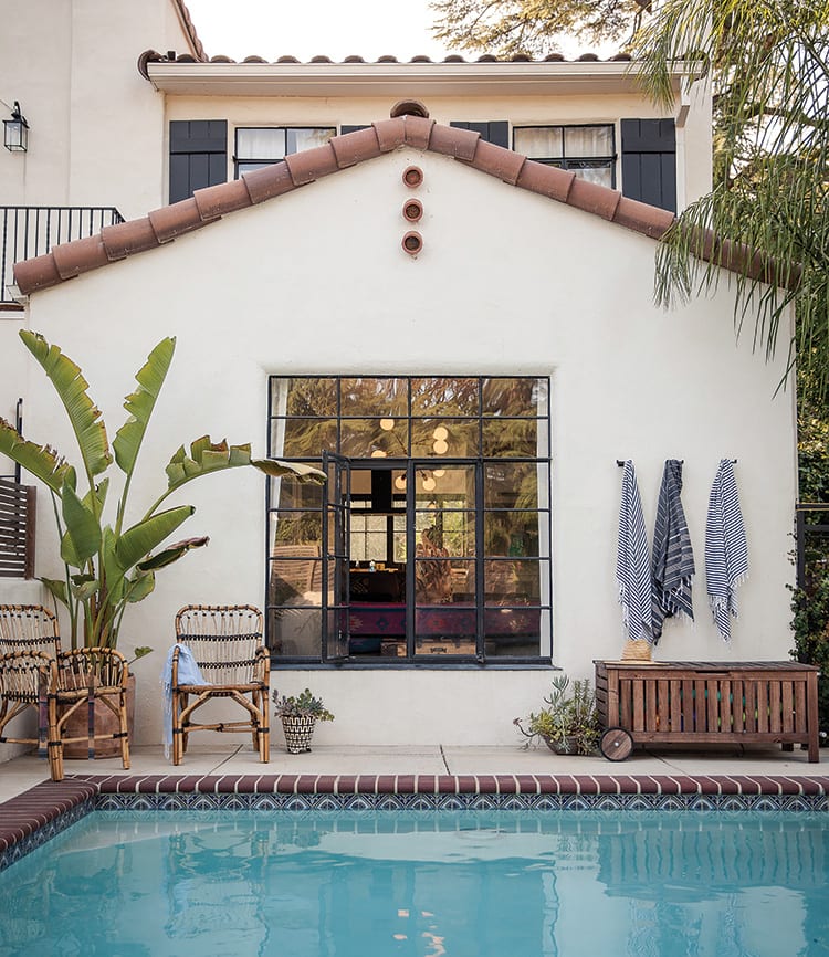
Anyone who has ever fantasized about moving to California knows part of its charm is indoor-outdoor living—all year round. But for too long, Christina Valencia and Kele Dobrinski, the married couple behind design and branding firm Colossus Mfg., were living in a 750-square-foot San Francisco unit with “zero outdoor living space,” says Christina. Now with three young children, the couple decided to decamp to Kele’s native Sacramento and take on one of the biggest projects of their lives—“a 1930s Spanish Revival home that hadn’t been touched in more than fifty years,” she says. “The exterior was a dingy yellow color and covered in dying trees; you really couldn’t see it from the street.”
The interior of the 2,324-square-foot house wasn’t much better, with teensy hallways that just didn’t flow and a stuck-in-time kitchen, complete with linoleum floors and scalloped edges on the cabinetry. The couple revamped the floor plan entirely, opening it up and taking it from three beds and two baths to four beds and three baths. “The back of the house was an old, dilapidated sunporch; we made half [of it] our master and half the baby’s room,” says Christina. Even cooler? Kele grew up around construction with his father, a general contractor, so they were able to complete nearly the entire project themselves.
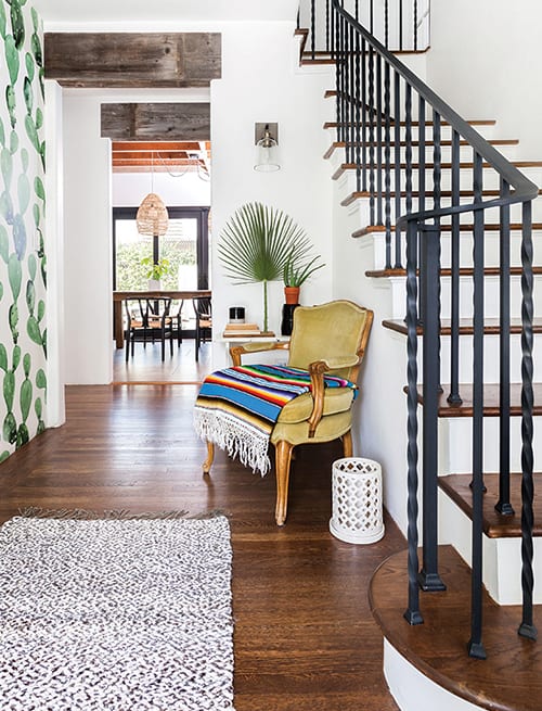
Passionate about preserving the home’s Deco-era charms, the couple repurposed leaded glass from the original built-in hutches as transoms and glass for their upper kitchen cabinets. They also infused the home with unexpected and affordable finds. Kele assembled the twinkling living room chandelier from an online kit found on famed lighting designer Lindsey Adelman’s website. Another favorite budget-saving tactic: the wood beams over the hallways were from an old scrapyard. “It must have been about $40 worth of materials,” says Christina.
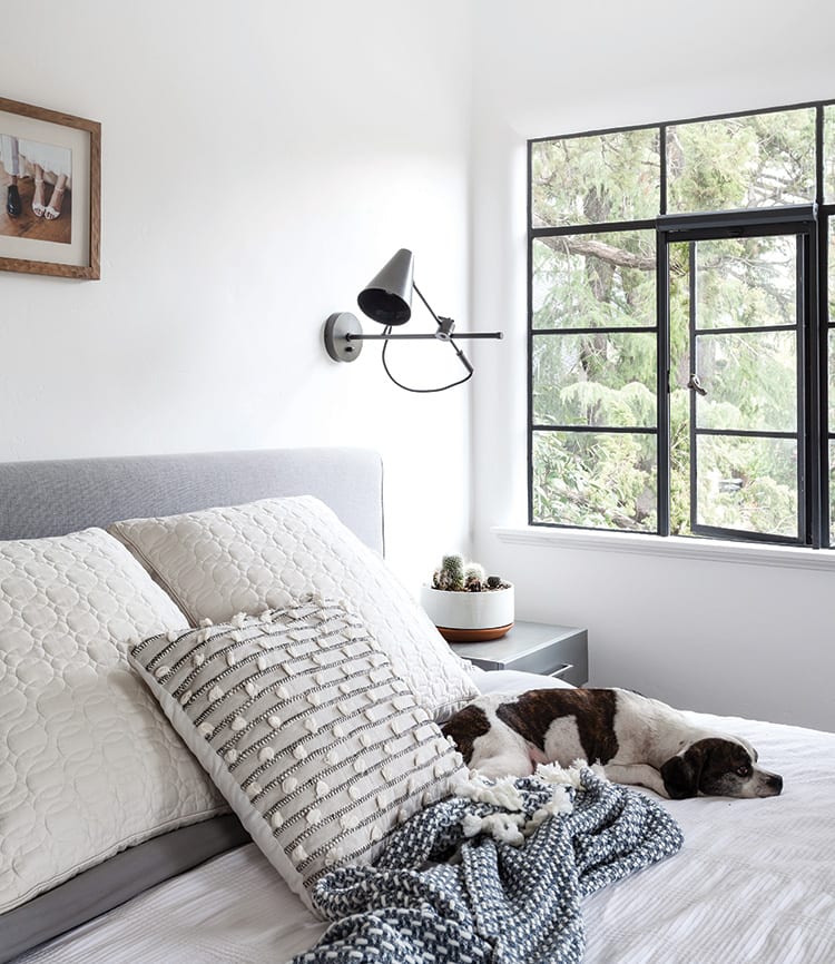
The design duo’s trademarks are layering and utilizing texture. “That doesn’t necessarily mean totally boho or seeing how many layered pillows you can get in one spot,” says Christina. “But we try to create spaces that feel comfortable and lived in and loved.” They’ll often select a neutral palette and build on it. One foundational trick: varying textures in complementary colors. “People are afraid of textures and putting multiple textures together; staying within the same color palette can confine your search—like doing all browns and grays.”
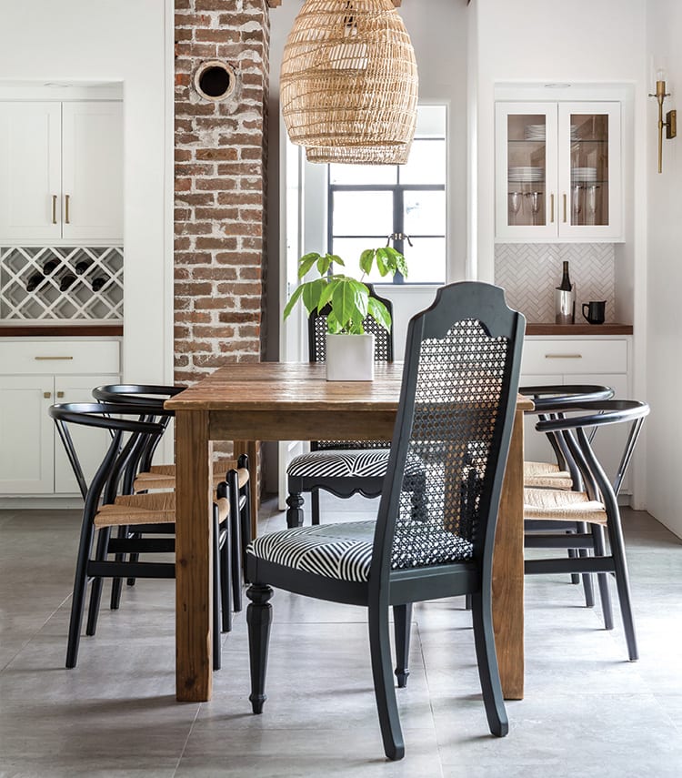
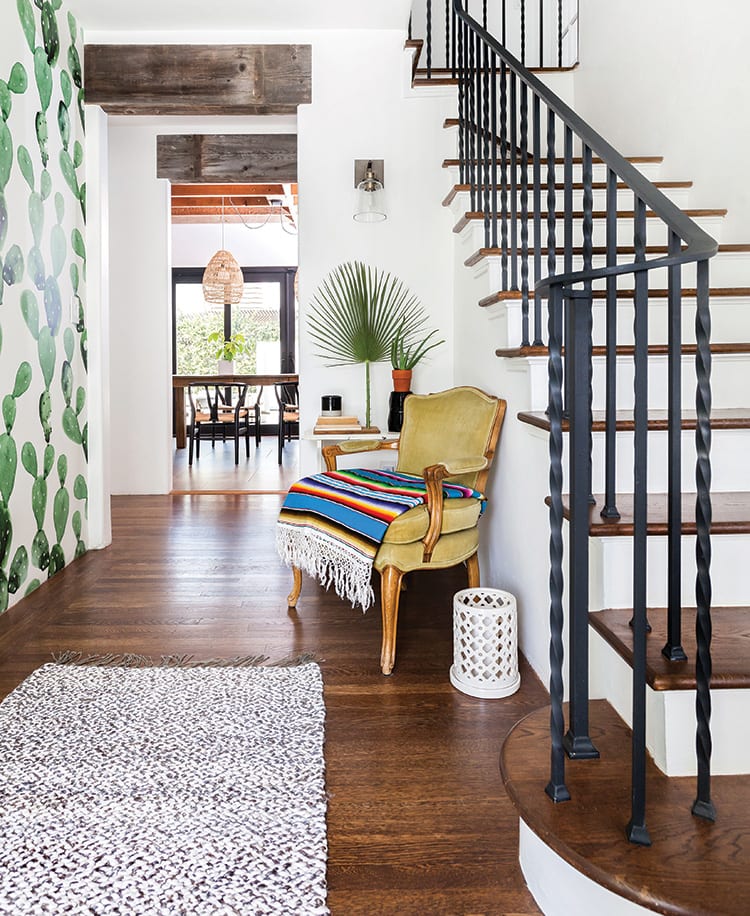
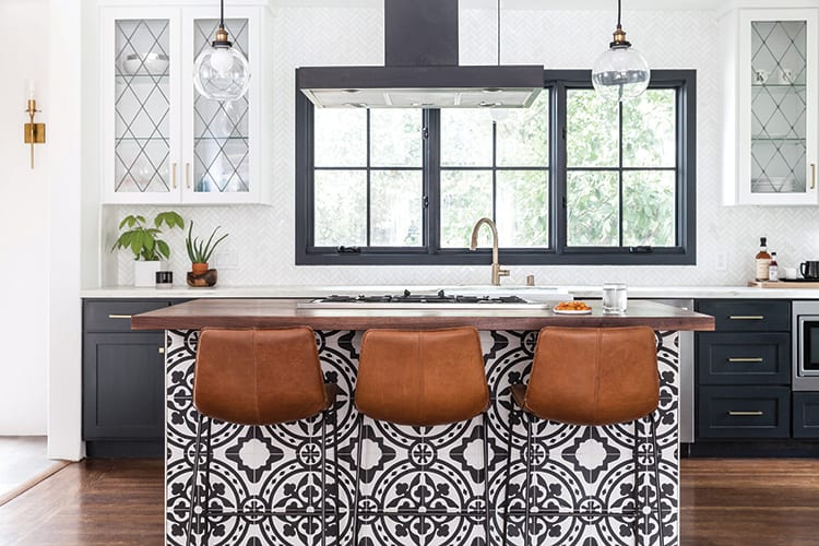
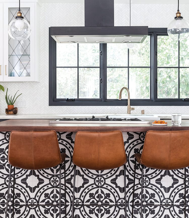
The pair is also fervently trend-avoidant, opting for timelessness instead. “You can’t be looking at Pinterest and emulate it,” says Christina. “Kele is always teaching me to look five years beyond and find something that lives within the character of the home and can live on for ten years.” With three young children, that often means selecting kid-friendly pieces that can take some wear and tear, like vintage finds that are preloved. “Nothing in our house is high-maintenance; it just can’t be!” she says. Some of her favorite family-friendly choices: leather barstools that seem to look better with age (and can be cleaned with leather cleaner) and heathered fabrics that hide grime. “That’s one of the reasons we like texture so much,” she says with a laugh.
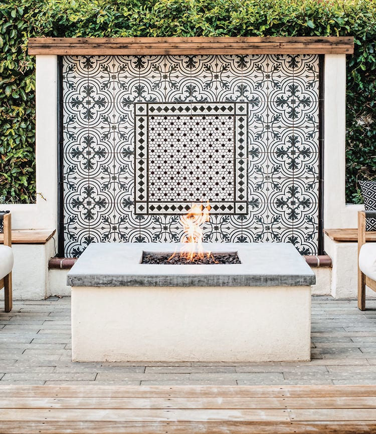
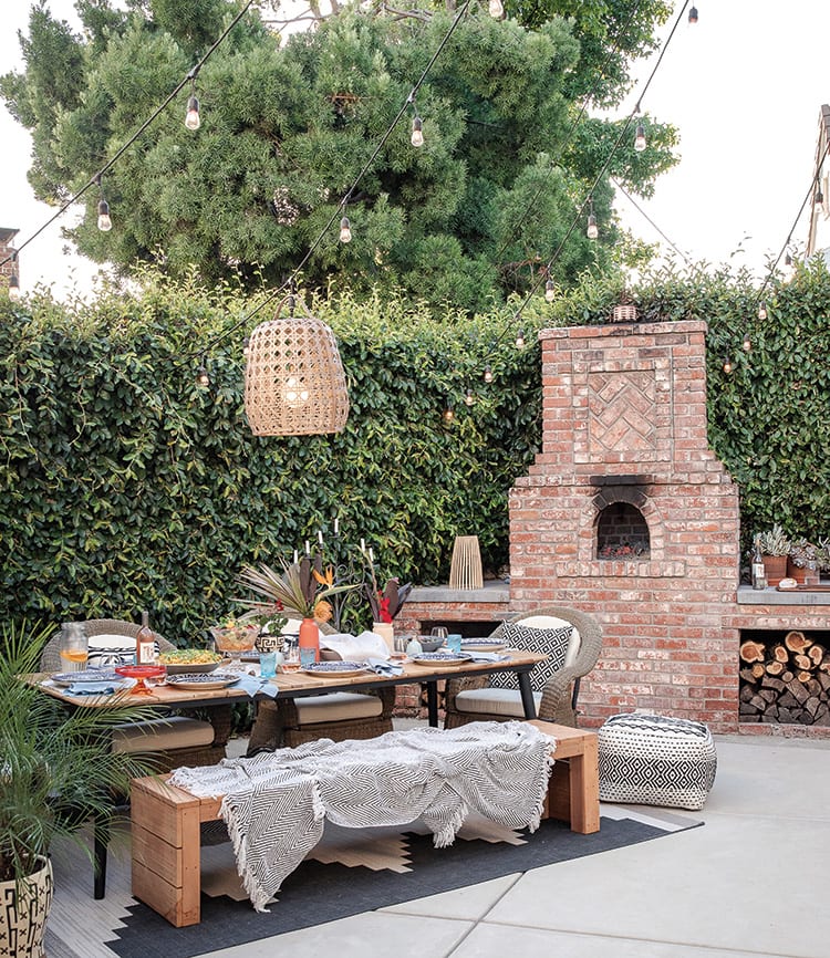
When the family moved into their new home, the outdoor area was essentially a lackluster patch of dirt. “We’re outdoor people; we want to be outdoors all the time! But our backyard is quite narrow,” says Christina. They carefully planned each outdoor hangout spot to maximize functionality within the small footprint. “We redid the crumbling pile of bricks into a pizza oven, and [we] added different levels of seating on the deck so kids and friends can comfortably hang out,” she says. They also created an alfresco dining space with many of the same touches as an indoor one, including a cozy rug underfoot and chandelier twinkling overhead. “I even found an old piece of art at an antique market, drilled holes in the side of the garage, and hung it up,” she says. “It feels like an extension of our indoor home now.”
