IN BROOKLYN, THREE STORIES TELL A NEW ONE
WRITTEN BY LAUREN DUNEC HOANG
PHOTOGRAPHY BY MIKIKO KIKUYAMA
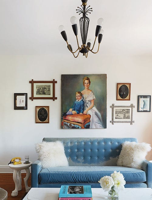
Vintage prints, gleaned by the homeowners from thrift stores, adorn the wall above a crushed-velvet sofa and custom marble-topped coffee table. A black-and-bronze chandelier adds a moody overhead accent.
When a couple purchased this early 1900s fixer-upper in Brooklyn’s Crown Heights neighborhood, they were able to look past the dark rooms and general disrepair to see the potential of the space. The creative professionals quickly amassed a long wish list. At the top? Update the top two floors of the home where they planned to open the layout to allow for plenty of natural light. The ground floor would be turned into a rental. But the three-story building’s long, narrow footprint and dated floor plan did not make this easy.
“The upper floor was divided up into a warren of small rooms to accommodate two small apartments, and [it was] in very poor condition,” says architect Jeff Etelamaki, principal of Etelamaki Architecture, the firm hired for the renovation. “The second floor was also in disrepair, though less so, and dark.” Etelamaki proposed a plan for gutting the top two floors, including cutting holes in the ceiling to make room for two large skylights, and tearing down interior walls to open up the floor plan. He also suggested relocating the staircase from the side to the center of the house. This move would accomplish two design goals: open up the building’s interior to bring in more light from the new skylights and create a more graceful entryway to the upper-floor flat.
“THE LAYOUT HAS A FAIRLY MODERN SENSIBILITY WITH CLEAN LINES AND AIRY, INTERCONNECTED SPACES.”
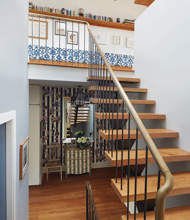
Fast-forward past three months of design and another six months of construction, and the interior of the town house is hardly recognizable as the dark, century-old home it once was. In the new layout, you enter the home at street level (through a hallway shared with the ground-floor rental), pass through a private door, and walk up a flight of stairs to the second-floor landing of the duplex. “It’s here that it feels like you’ve really entered the living space of the home,” says Etelamaki. The landing, covered in bold, striped wallpaper and illuminated with a vintage chandelier, helps establish a sense of arrival and offers a taste of the home’s warm and eclectic decor style. On this floor, in addition to the entry landing, there are two bedrooms, a small office that doubles as a guest bedroom, a bathroom, and a powder room.
Head up the light-filled stairway with newly-exposed brick to the top floor and main living area. Here, there is an open kitchen and dining space, a living room, powder room, and small outdoor terrace. The decision to position the main living areas on the top floor of the home, while less conventional, allowed the architect to capture as much natural light as possible. Now, sunlight washes over the new kitchen and dining room, highlighting the rich texture of the exposed brick against bright-white cabinets and quartz Caesarstone countertops. A new built-in banquette seat, upholstered with a fresh blue-and-white floral fabric, runs along one wall of the room, introducing a broad stroke of color and pattern. Sliding glass doors open from the dining nook to a small roof terrace that received a new deck and built-in planters for the clients to grow tomatoes, culinary herbs, and flowers.
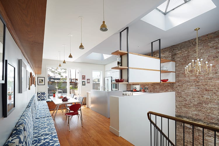
SUNLIGHT WASHES OVER THE KITCHEN, HIGHLIGHTING THE RICH TEXTURE OF THE EXPOSED BRICK.
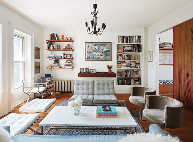
In the living room, Etelamaki preserved much of the original character, such as moldings and window castings, while adding a built-in bookcase, bar, and the sliding door, which separates the living room from the dining area. Originally, the plan was to make the sliding door solid red; however, given the clients’ creative backgrounds—the husband cofounded a digital media start up, the wife works as a costume designer for television—Etelamaki realized that the screen provided an opportunity to showcase their personalities and design aesthetic. The wife proposed a period photograph of a woman in a Victorian era dress, which Etelamaki’s team simplified and laser cut into teak veneer plywood. The teak overlay was mounted atop the original red sliding door so that pops of color peek through as patterns on the dress and the sweep of the woman’s hair.
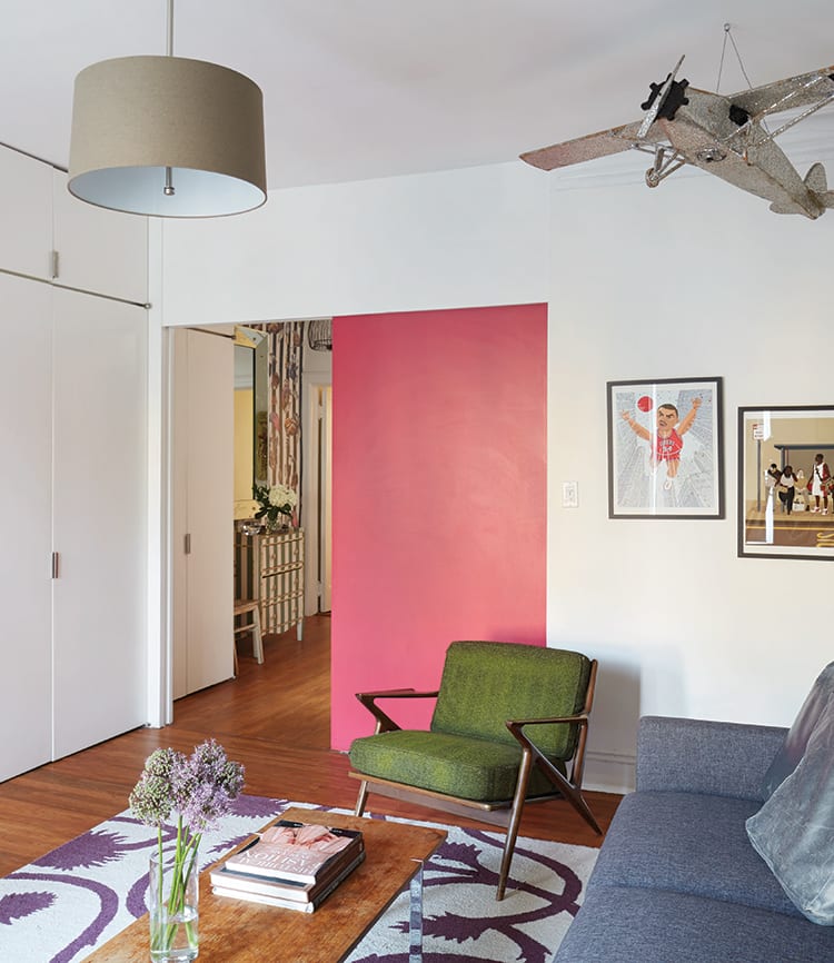
The clients furnished the rooms boldly and personally, using a mix of vintage finds, modern accents, and heirlooms passed down from family members. Every New Year’s Eve, they host a group of a dozen or more friends—putting that extra-long banquette seating into use— for a party that quickly became a tradition. All in all, it’s a second life for an old house in the hands of a couple who made it their own.
