WHOLE-HOUSE RENOVATION MELDS MODERNITY WITH TRADITION
WRITTEN BY VICTORIA HITTNER / PHOTOGRAPHY BY HARIS KENJAR
WHEN INTERIOR DESIGNER CASEY KEASLER EMBARKS ON A NEW PROJECT, SHE IDENTIFIES THREE KEY WORDS THAT SERVE AS A THEMATIC BLUEPRINT. HER GUIDING VERBIAGE FOR THE RENOVATION OF THIS TWO-STORY COLONIAL IN THE MONTLAKE NEIGHBORHOOD OF SEATTLE, WASHINGTON? COZY, FAMILY FRIENDLY, AND LAYERED.


The breakfast nook has become the heart of the home, with practical features for messy family meals and sophisticated entertaining alike. “It seats about six people more if they need to, and there’s extra space if they want to bring in a kid’s table for bigger family gatherings,” says Keasler.
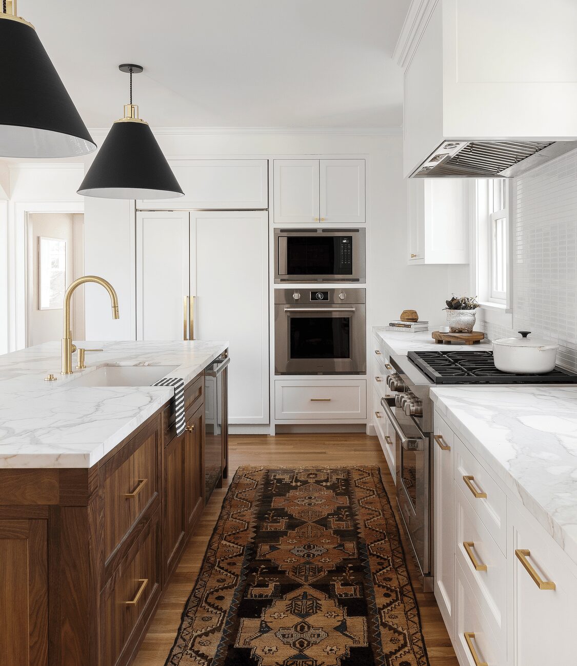
A vintage runner adds warmth to the sleek Calacatta marble and stainless steel of the kitchen, while bar stools from West Elm provide spill-proof, family-friendly seating at the custom island.
“I want to create spaces that are personal and an extension of [my clients’] personalities,” says Keasler, owner of Portland, Oregon-based studio Casework. For the inspiration behind this whole-house renovation, Keasler drew upon a long-established friendship with the homeowners. “They had just had a little girl and since then, they’ve had a second,” says Keasler. “They bought this old colonial house with very compartmentalized rooms and wanted to be able to really grow into it and for it to be their forever house for their family. It was incredibly important that [design] was family friendly in terms of durability, but also function in how the house flowed.”
Keasler and her team worked alongside Ainslie-Davis Construction and Paul Crowther Design to change the layout of the existing structure, built in 1925. The original blueprint included four bedrooms and one bathroom upstairs, with a powder room on the first level. A first-floor addition was created to accomodate a new kitchen, pantry, breakfast nook, and open up space for a much larger living room and dining room. Upstairs, two of the bedrooms were combined to create a master suite, complete with a full bathroom and walk-in closet. A stand-alone bathroom, guest room, and kids’ room are across the hall.
“Old homes are always full of surprises,” notes Keasler. “You start tearing apart walls and opening things up and you always find something unexpected.”
And while some of the home’s older features were less than desirable—think wallpaper in every room and boxy, metal cabinets in the kitchen—others were far more welcome.
“[The historical features] add real architectural interest,” says the designer. “New millwork is hard to replicate. People don’t really spend the time and money to replicate that sort of work anymore. Here, it was important to. It had some really beautiful features that were worth saving.”
In the living room, Keasler and her team kept the original fireplace mantel, marble surround, and dental molding, as well as the nearby built-ins. Bronze, articulating sconces top the fireplace, offering a playful, modern take on the traditional candlestick reflector. Continuing the charming mix of historic and high style, the original coved ceilings and leaded-glass windows remain throughout the home.
“We kept a lot of the original windows,” says Keasler. “But in the kitchen [and breakfast nook], those are all new. We added in the leaded component so that they still have that feeling of historical quality.” An added bonus of the reproductions? “They actually open and aren’t painted shut!”
Similarly, Keasler’s team sanded and stained the hardwood floors of the kitchen addition to match the original oak found elsewhere in the house. The simplicity of the traditional oak contrasts beautifully with the rich walnut and Calacatta marble of a custom-designed island. Bright-white tiles from ANN SACKS create a glossy backsplash while brass hardware and pendant lights add further warmth to the space.
For paint, the designer used Benjamin Moore Snowfall White on the walls and Benjamin Moore Chantilly Lace on the trim in every room but the girls’ bedroom, powder room, and entryway. Keasler maintained a palette of warm neutrals to keep the space bright and welcoming and highlight the pops of color found in the homeowners’ vibrant art collection.
Family-friendly seating is available in the nearby breakfast nook, where a custom built-in bench echoes the traditional architecture of the home. To modernize the look, Keasler and her team painted the bench white and paired it with a sleek Eero Saarinen tulip table. “They ended up loving this area so much that they [eventually] turned their dining room into a music room and they use [the breakfast nook] as their dining room now!” notes Keasler.
Durable fabrics are found in all high-traffic areas. Easy-to-clean leather can be found on the kitchen bar stools and chaise sofa in the living room, while layers of textured rugs add depth—and some splashes of color—in most of the shared spaces.
“What really contributes to the warmth of the house is its layered aspect,” explains Keasler. “It’s really textural rugs and not a lot of color throughout the house, but there are lots of layers of texture.” The earthy tones offer balance, while the textural contrast introduces character.
As a friend of the family, the designer notes she herself has spent many cozy breakfasts and relaxing evenings in the inviting space. It was important to create a home that not only accommodated the family’s inviting lifestyle but highlighted it.
“We wanted [the home] to feel really clean and fresh—especially with all the wallpaper and wood paneling that was on there before,” says Keasler. “We gave everything a fresh coat of paint . . . and used neutrals that are soft and subtle and textural. We really just wanted it to be a backdrop for their life and their family.”


Keasler kept the home’s neutral palette fresh and modern with unexpected pops of color. Mint-green velvet chairs balance out the warmth of the living room.

Deborah Farmer


