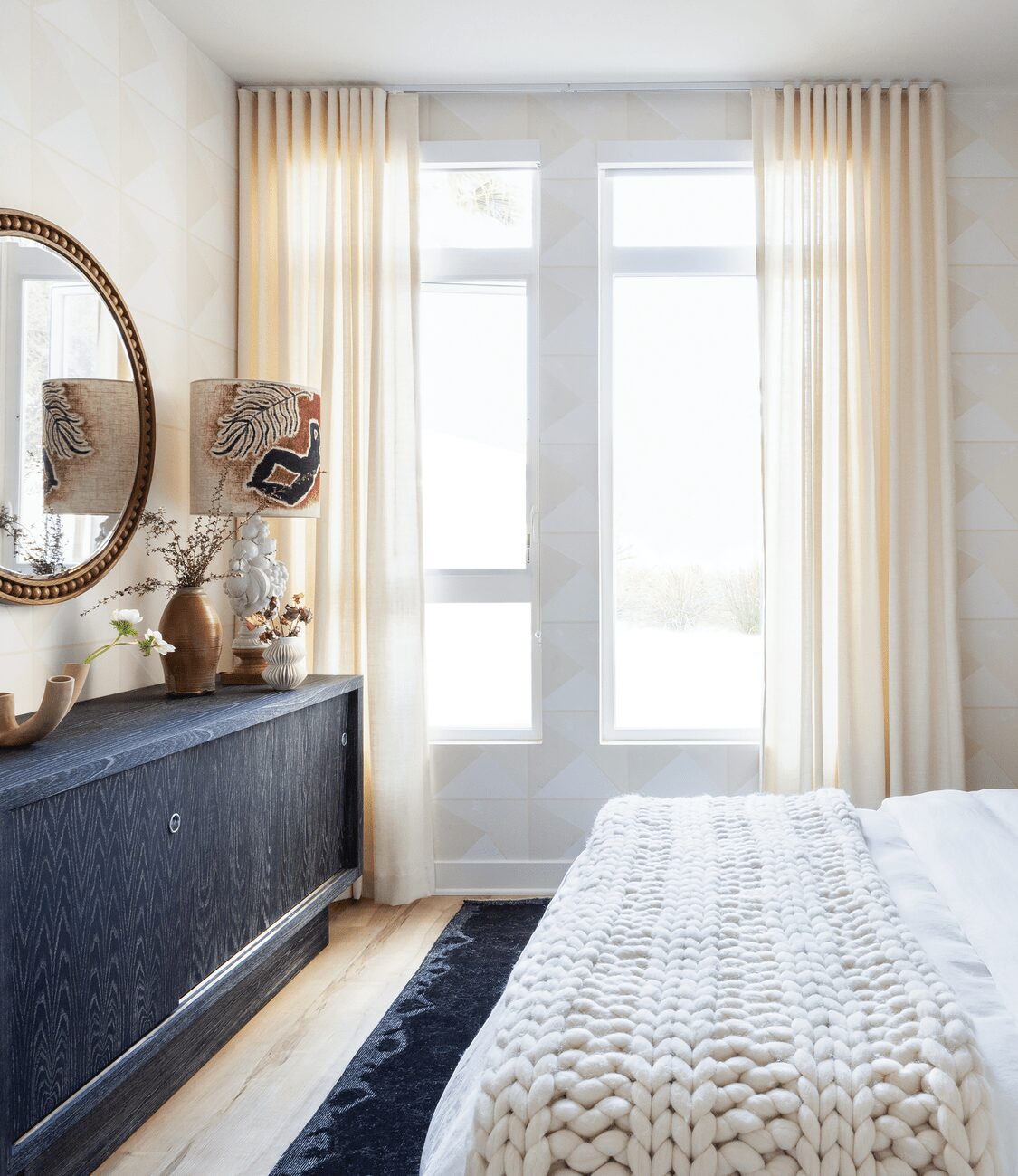
A WEST HOLLYWOOD BEDROOM WITH STAYING POWER
It makes perfect sense for a bedroom to be serene, but neutral-on-neutral interiors don’t need to be as bland as oatmeal without toppings. Take this dreamy West Hollywood, California sleeping space designed by Los Angeles decorator Stefani Stein, which suits its glamorous locale—and isn’t sleepy. A hefty ivory knit throw blanket from The Citizenry and plaid juniper-green throw pillows from ZAK+FOX cozy up the bed, while a photograph of 1960s supermodel Twiggy adds instant cool factor above the headboard. “I often gravitate towards vintage and love a bit of the unexpected, and even with neutrals, that isn’t really an exception,” says Stein. “Rather than sticking with the typical abstract art, I brought in photography and geometric textile accents. They are subtle, but they help differentiate the space a bit.”
WRITTEN BY KATHRYN O’SHEA-EVANS / PHOTOGRAPHY BY AMY BARTLAM

The bedside table lamps are by Aerin for Circa Lighting; the pillows are ZAK+FOX. Chunky wool throw blanket, The Citizenry.
Stein adds vintage charm to the sleek credenza with a 1970s table lamp and a hand-painted shade by RF. Alvarez. White anemone flowers supply a burst of organic cheer on the tabletop.
Gauzy custom draperies in ivory linen soften the otherwise streamlined bedroom.
Stein had another challenge with this room, part of a one-bedroom, one-bathroom apartment: getting a megawatt look without going for bespoke furniture, which tends to take a lot of time to produce. “This client had a rather tight move-in deadline, so we had to get creative while working with primarily stocking vendors, rather than our typical custom approach,” says Stein. Her technique: investing in key pieces that would keep the flow effervescent and easy, not overbearing. Hunting for vintage accessories gave the interior a one-of-a-kind feel. “Regardless of whether I’m designing custom pieces or sourcing stock items, the goal is always to capture a bit of their personality and energy. And, one of the fantastic aspects of vintage shopping is that vintage pieces are, by nature, in-stock.”
Because the room’s footprint was small, Stein relied on her small-space trademarks to keep it feeling spacious. “Designing a small space can certainly be challenging; however, there are a few foolproof solutions that often help. When working with a smaller footprint, I always want to focus on a finished space that feels more open and definitely not cluttered. I recommend avoiding items that appear heavy or bulky at the base. While homes of course need storage, so a few pieces are inevitable, varying the bases and ensuring several items have legs prevents the furnishing from feeling too dense.” In the bedroom, that translates in the blonde oak CB2 side tables. “Stylistically, clean lines can also help a space feel more open. And of course, try to situate the furnishings to take advantage of each room’s natural light.”
When it came time to selecting art and accessories, Stein went for surprising touches, from a five-armed vase from Soho Home x Anthropologie to a decorative lamp with a hand-painted shade by RF. Alvarez—plus that eye-candy photograph of Twiggy. “Art is really what makes a difference between a good space and a great space. I like to mix mediums and play with scale. For example, I try to avoid putting multiple abstract pieces in the same space, unless of course, they are part of a diptych or triptych. Large-scale photography can be tremendously impactful. It can create a focal point and bring depth to a space.”
It helps, too, that Stein opted for a low-key graphic wallcovering from August Abode, in easygoing ecru that would work with almost anything. Against the windows, “The floor-to-ceiling drapery helps elongate the space and adds to the sense of airy openness. Also, ivory linen provides a lovely, soft filtered light.” Anchoring the space: the streamlined bed from Article and sideboard from Noir. These minimalist furniture choices are more than just sleek looking in a teensy room. “Low-profile pieces were selected primarily to help the small space feel more open and airy, which definitely adds to the serene vibe,” she says. “For the furnishings and decor, we wanted a calm feel, but one that felt inviting . . . some ebonized accents and earthy touches preventing it from feeling austere.” The effect, in a word: dreamy.
bedtime basics
Unlike New York, the city that never sleeps, Los Angeles is all about getting its beauty rest—after all, this is the home of Hollywood. Designer Stefani Stein offers her tips for making one’s bed, literally.
Love your wrinkles. Opt for linen bedding, says Stein. “A linen duvet imparts a bedroom with that effortless quality. It isn’t for people who like a perfect and crisp bed, but I find it an essential element in a coastal-cool bedroom.”
Sleep on it. In this featured design, Stein selected a bed with a “California cool” aesthetic: Article’s Tessu bed in Glaze Gray, with a cozy upholstered surface and wood-slat base that allows the mattress to be kept low and lean.
Add texture. Getting the textural mix right can be tricky, but it is truly as easy as tossing a chunky blanket, like this one from The Citizenry, over your bed. “Soft knit throws or cozy quilted blankets at the foot of the bed add a layer to the space without overpowering things,” she says.

Deborah Farmer


