A FULLY RENOVATED CRAFTSMAN WITH CONTRAST
WRITTEN BY JEANINE MATLOW / PHOTOGRAPHY BY JEFF HERR
Not the least bit color shy, Whitney Jones—residential designer and owner of Wynter House Designs in Atlanta, Georgia—could say the same for her clients. The owners of this craftsman bungalow in Atlanta’s historic Grant Park neighborhood came to her for a major remodel. Her bold approach often features saturated shades applied in a high-contrast manner, which was right at home in the neighborhood known for its distinctive architecture. “I use color strategically in a mix with grounded neutrals,” she says. “There are special moments of color with elements around it that are a little quiet.”
Her go big or go home design philosophy fits her dramatic palettes where placement and contrast are key. “When there’s too much similarity, everything washes away,” says Jones. “I like to use colors throughout and string them through different spaces to thread a relationship. You may not even know until you take a step back and start to see shades of yellow or blue. That way, each individual space can have its own story and be coordinated.”
In this high-spirited home, black and white complement the transitional aesthetic that’s a bit eclectic, too. The exterior presents a simple yet bold combination of black and white and the interior’s white walls help saturated shades shine. “When you have color on large components, you want a little bit of that white background,” says Jones.
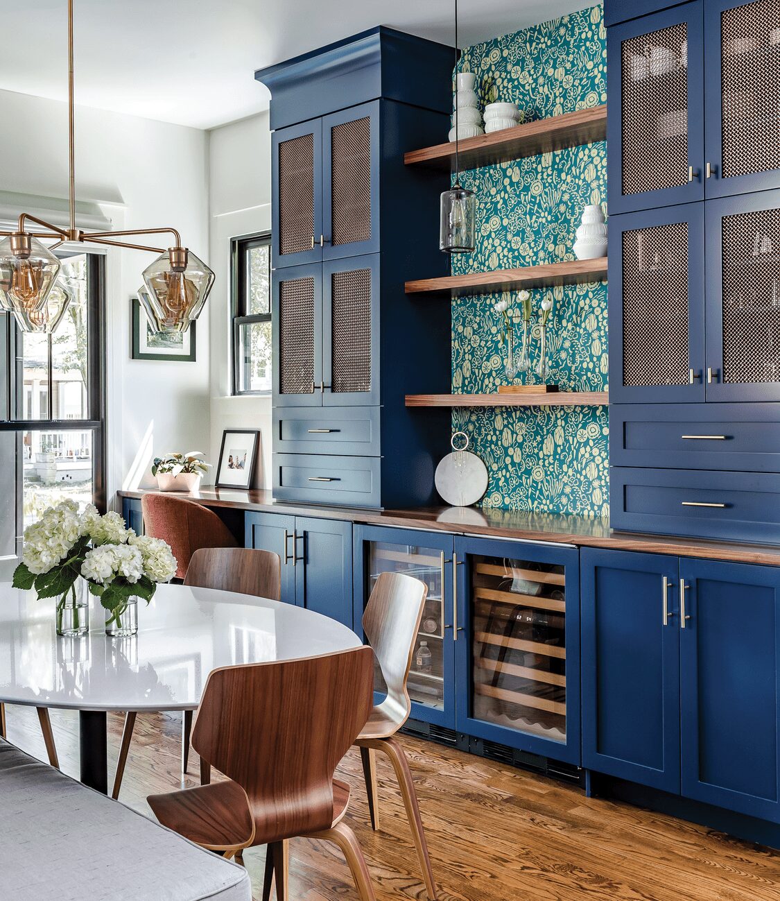
Blue hues define the dining room where painted cabinets are paired with a tropical pattern wallpaper and warm woods like walnut add a welcoming touch.
Contrast kicks up the colors in the living room, with subdued hues like gray and saturated shades of blue. Black trim on windows and doors adds drama to the white walls.
A secondary color scheme strikes a playful note in the family room with pink and purple pillows complete with delightful tassels and trim.
The designer prefers coordinating colors and tones rather than matching, like the yellow and blue hues and the walnut wood that appear throughout in slightly different variations. In the living room, a walnut mantel and shelves with a weathered look join the slate-gray tile on the fireplace. The commissioned artwork above introduces cobalt blue and muted yellow tones, while the velvet sofa repeats shades of blue and gray.
Behind the sofa, a peek-a-boo built-in served as the jumping-off point and now a standout feature in the new open floor plan. With vertical plumbing housed on either side, Jones designed the perfect piece to reveal colorful elements in adjacent spaces like the dining room—where shaker-style cabinets in the bar area wear a custom shade of navy.
“It’s a little more modern for the young family,” she says of the color on the high-style bar. Mesh panels in brass embellish upper cabinets, while teal wallpaper with a tropical print adds a splash of pattern. Blue hues continue throughout the kitchen on the island and cabinets. Blue cabinets in the kitchen feature brass hardware, while white cabinets are outfitted with oversize matte-black accents. Because the house is packed to the max with storage, Jones says they could lighten the load by flanking the forty-eight-inch range hood with walnut shelves instead of upper cabinets.
The renovated powder bath shows a reflection of the open shelves in the mirror above the wall-mounted sink. In the background, graphic yellow and white cement tile was installed for maximum impact. “It trails the color through the space in a small way for a big wow factor that becomes a focal point,” says Jones. “Even though it’s tucked away, you get a little snippet of it with the door open.”
In the family room, a vibrant teal feature wall with a diagonal pattern made from strips of molding becomes another focal point that awakens the space. An accordion door with a retractable screen leading to the yard makes it seem like a screened-in porch. “It feels like a little bit of an oasis,” she says.
Animated accents kick up the color scheme. “I like to add two secondary palettes that are very playful since they can be changed out at any given time,” says Jones. “The pink and purple pillows with stripes and tassels have a very saturated palette that speaks to their personality and aesthetic.”
The primary suite is a bit more subdued than the rest of the home and highlights contrast in the bath with black geometric tiles. “With white grout, the shape becomes more interesting. Here, there is less of an extreme color palette and a little more pattern and shape,” says Jones, who encourages others to find shades that speak to them and to step outside their comfort zone. “Don’t be afraid of color. It’s extremely impactful and very personal.”
stark contrast
Make your mark with these tips on creating contrast from designer Whitney Jones.
Make a statement. Repeating the same color palette throughout a house makes distinct combinations less disjointed and more cohesive.
Diversify your assets. Create contrast with colors, sizes, shapes, and materials, like smooth with rough and shiny with matte.
Keep it together. Large hardware gives two-tone cabinets one storyline. “That way, they’re not just a supporting piece. They play a role,” says Jones.
Go the distance. There are more ways to introduce contrast than with black and white. For the level of distinction to be successful, pair deep hues with muted tones.
Layers go a long way. Similar styles with different details and finishes still relate to each other, like the walnut elements with different treatments that appear throughout this featured design.
Continuity extends throughout the craftsman bungalow with variations of the same color palette.
Brass and black accents like the light fixtures in the kitchen and dining area contribute to the cool vibe.
An ingenious peek-a-boo built-in offers storage and display space while boosting the views between the living and dining rooms.

Deborah Farmer


