A Modern-Day California Surf Shack
WRITTEN BY CAROLYN M. RUNYON
PHOTOGRAPHY BY KURT JORDAN PHOTOGRAPHY
Rincon is one of the most famous surf spots in California, drawing surfers from all over the world. The circa-1920s beach shack on this Rincon Point property was a near tear down, but CJ Paone, owner of Ventura-based Archipelago Workshop, wanted to maintain the history and vibe of the original era. His award-winning design and remodel of the now 2,100-square-foot home evokes an “old house” feel with vintage style architectural elements, uncluttered spaces, and a bright beachy atmosphere.
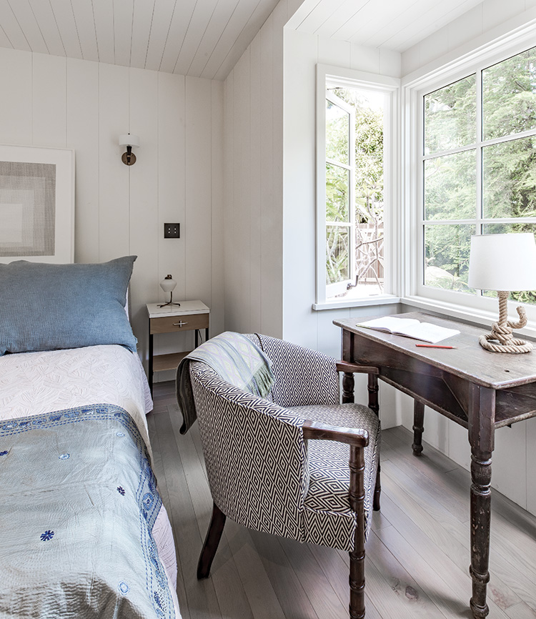
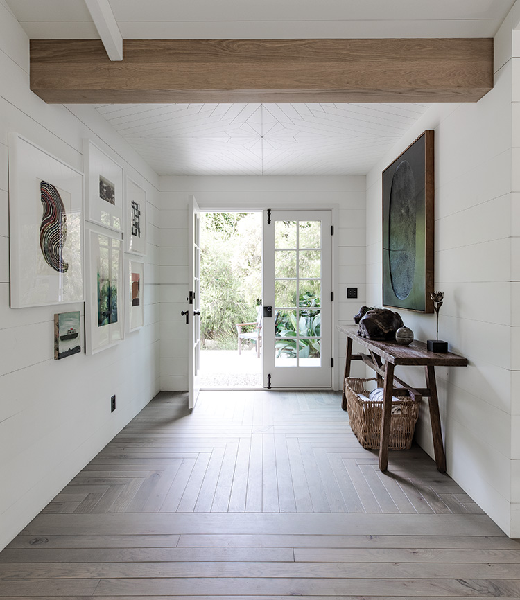
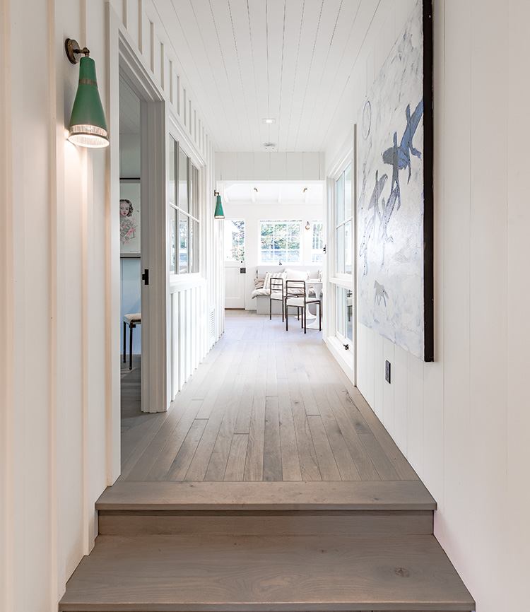
“There was no drywall in the ’20s, so we covered all the walls in wood,” explains Paone. “The wood grain telegraphs through the layers of paint, and when you are up close the texture is immediately visible. As you back away from the wall, the butted boards offer another interesting tactile dimension to the space.” He adds that the wood is a durable element. If the wall is scraped or scuffed, it just makes the space feel more lived in. “Wood wears in, not out,” says the designer. A background of white paint kept the home light and bright and allowed the owner’s art to pop. Paone added wood elements, like the flooring and vintage furniture, for warmth and a homey feeling.
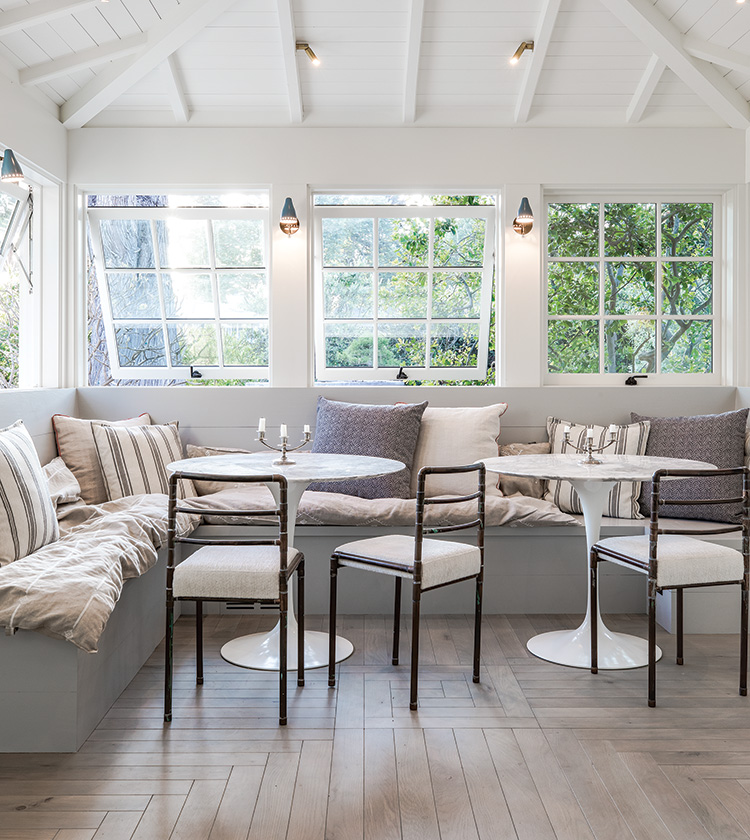
Many of the ceilings feature exposed rafters. Paone changed the proportion of the spacing between rafters to make each room distinct. In the living room, the widely spaced rafters—each with smaller, shorter depth than is typical—give the room a more open feel. The breakfast area has narrow spaces between the rafters, creating a cozier atmosphere.
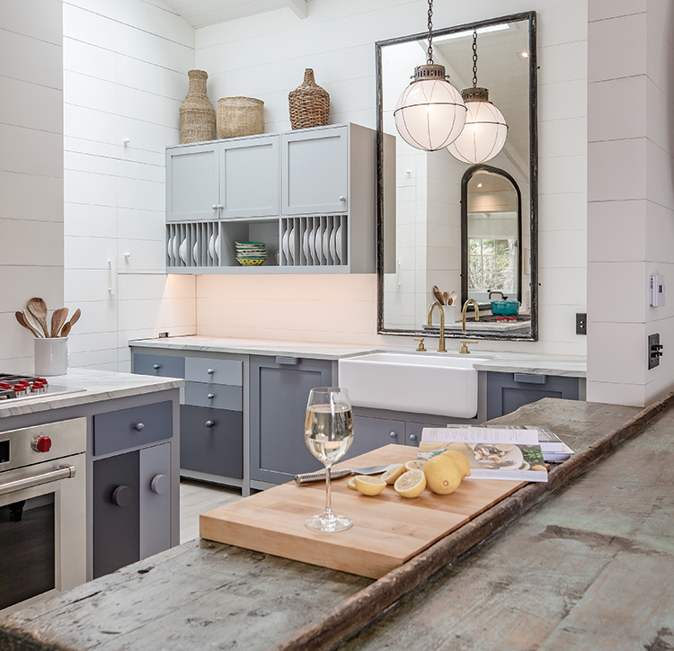
The kitchen has an intriguing and unusual layout. “We tried to downplay the ‘business’ of a kitchen in this design,” says Paone. “We kept with an open-plan great room concept that allows someone in the kitchen cooking to talk to guests in the dining room.” A vintage worktable is hidden by the dividing wall between the kitchen and dining room. The stove has a downdraft so there’s no need for a range hood. Paone placed a large mirror behind the farmhouse sink instead of a traditional backsplash. These changes add a bit of novelty and keep the kitchen from looking like a kitchen. Cabinets are a simple Shaker style in a blue-gray tone with flush and set doors. The white walls and ceiling add brightness to the space, while the skylights introduce more natural light. The room is L-shaped, and around the corner from the main kitchen area is a huge built-in refrigerator and space to hide the after-dinner items that normally clutter a kitchen.
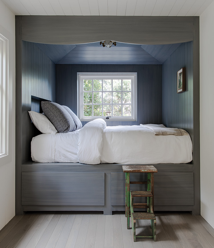
Paone designed several built-ins to conserve space. To accomplish this, he widened the walls to fit custom pieces like beds, bookcases, and the refrigerator. In the bedrooms, the extended space allows for more storage under the mattresses. Without the need for dressers, the rooms look less cluttered. Niched beds also serve as sitting coves.
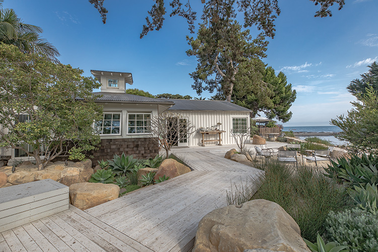
Dynamic, full windows are plentiful in the home and are perfectly functional. “In good weather, the awning windows can be opened wide so the outside spills into the home. And you can actually serve drinks and food through the opening,” says Paone. The outside and inside flow nicely, making the interior of this beach home feel more expansive. He designed the landscape areas using natural elements appropriate to the environment like stone, wood, sand, and gravel. Wooden boardwalks meander among huge rocks and natural landscapes, dividing the area into individual outdoor rooms often with lovely water views. A coral rock fire pit creates a welcoming sitting area for cooler nights, while a rock slab table and Brown Jordan chairs are arranged for comfortable conversation. The siding is a beachy board-and-batten pattern. Paone believes that scale and proportion are important elements of design. “The battens are larger and thicker than usual,” he says. “I saw a similar treatment in west coast Sweden when I visited and loved the interesting shadow pattern that appeared depending where the sun was.”
A century after the surf shack was first built, the quintessential Rincon lifestyle remains. “We were looking for informality in the design,” says Paone. “The kind of place where you wear flip-flops and can put your feet up on the furniture. A place where scuffs and scrapes and dents are OK.”
